Mastering CSS @starting-style and View Transitions for Entry/Exit Animations

Introduction
In the dynamic world of web development, user experience (UX) reigns supreme. Smooth, intuitive, and visually appealing interfaces are no longer just a luxury but an expectation. A common challenge developers face is creating seamless animations for elements entering or exiting the DOM, or for significant UI state changes. Traditional CSS transition properties often fall short when an element's display property changes from none to block, or when elements are dynamically added or removed, leading to abrupt visual jumps.
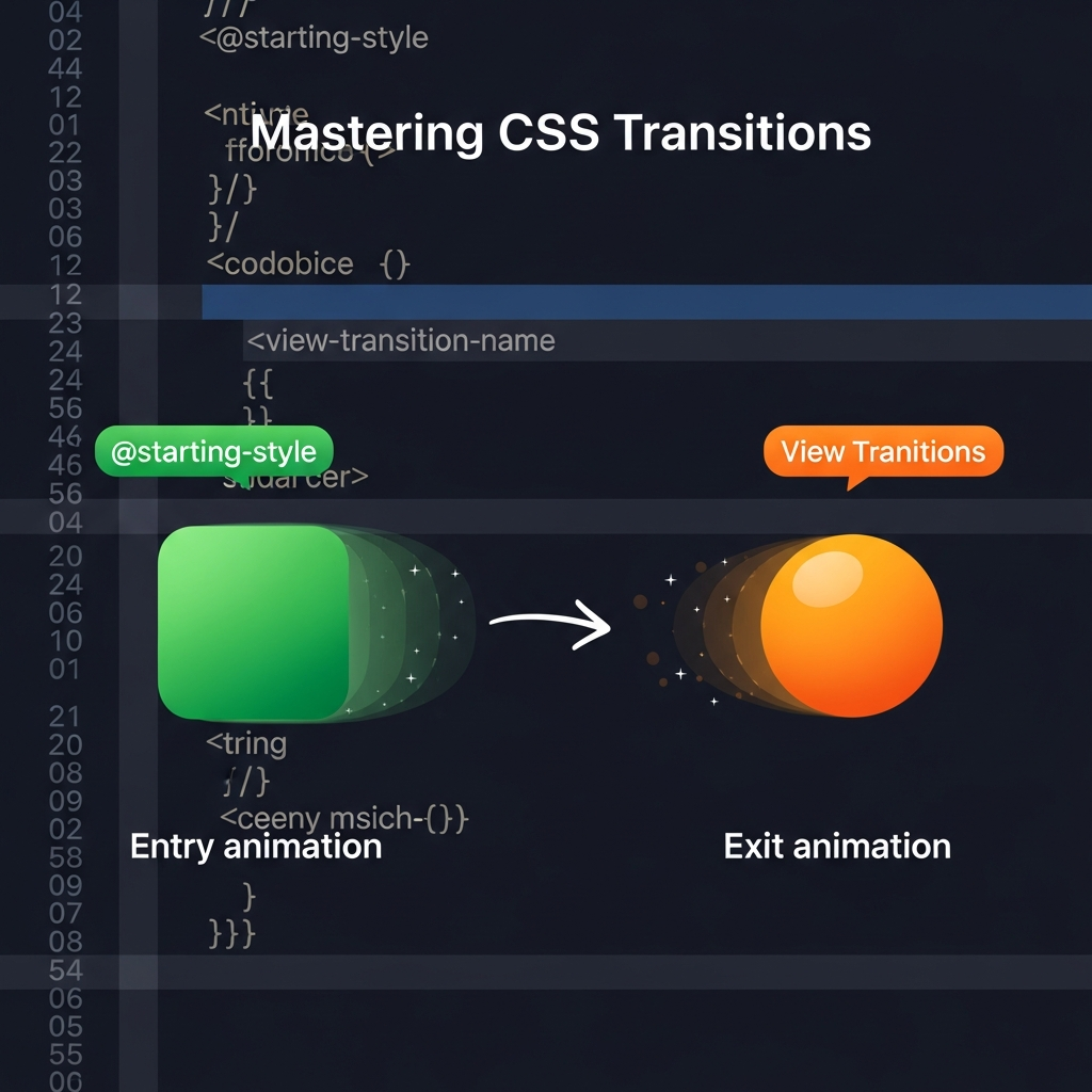
Enter @starting-style and the View Transitions API – two groundbreaking CSS and JavaScript features designed to revolutionize how we handle these complex animation scenarios. @starting-style provides a mechanism to define the initial state of an element before its styles are applied, allowing transitions to kick in gracefully. The View Transitions API, on the other hand, offers a powerful way to animate entire UI state changes, whether within a single page application (SPA) or across multiple pages (MPA), by taking snapshots of the UI and animating between them.
This comprehensive guide will delve deep into both @starting-style and View Transitions, explaining their core concepts, demonstrating their practical applications with code examples, and outlining best practices to help you master these essential tools for building truly engaging web experiences.
Prerequisites
To get the most out of this guide, a foundational understanding of the following is recommended:
- HTML: Basic document structure and element manipulation.
- CSS: Core concepts like properties, selectors,
transition,animation,opacity, andtransform. - JavaScript: DOM manipulation (adding/removing elements), event listeners, and asynchronous programming basics.
Understanding the Challenge: Why Traditional Animations Fall Short
Animating elements that appear or disappear from the DOM has historically been a tricky affair in CSS. The primary culprit is the display property. When an element's display changes from none to block (or any other value), it instantly appears. There's no intermediate state for a CSS transition to latch onto.
Consider a modal dialog. When you click a button to open it, you want it to fade in or slide up gracefully. However, if the modal's initial state is display: none;, simply changing it to display: block; and applying opacity: 1; will result in an instant appearance, as transition doesn't animate display.
Developers often resort to workarounds:
- Delaying
displaychange: Setopacity: 0;andvisibility: hidden;initially, then on interaction, setopacity: 1;andvisibility: visible;. After the transition, finally setdisplay: block;. For removal, reverse the process, settingdisplay: none;only after theopacitytransition completes. - Using
max-heightortransform: Animate properties likemax-heightfrom0to a fixed value, ortransform: scale(0)toscale(1). This avoidsdisplay: nonebut can be complex for dynamic content or can lead to layout shifts.
These methods are often verbose, require careful orchestration with JavaScript timeouts, and can become unwieldy for complex UIs. They also don't inherently solve the problem of elements that are removed from the DOM, as their styles are instantly gone.
Introducing CSS @starting-style
@starting-style is a new CSS at-rule designed to elegantly solve the problem of animating elements that are entering the DOM or changing from display: none to a visible state. It defines the "before" styles for an element, allowing the browser to transition from these styles to the element's current computed styles.
Without @starting-style, when an element appears (e.g., display: block), its styles are immediately applied. If you have opacity: 0; transition: opacity 0.3s; and then change it to opacity: 1;, the opacity: 0; state is never truly rendered, so there's nothing to transition from.
@starting-style fixes this by providing that initial "from" state. When an element is inserted into the DOM or its display property changes from none to anything else, the browser first applies the styles defined within the matching @starting-style block. Then, it immediately transitions to the element's actual computed styles, provided a transition property is defined.
How it Works:
- An element is created or its
displaychanges fromnone. - The browser checks for an
@starting-stylerule matching the element. - If found, the styles inside
@starting-styleare applied as the initial state. - Immediately after, the element's actual styles are applied, triggering any defined
transition.
Syntax
@starting-style {
  /* Styles to transition from */
  opacity: 0;
  transform: translateY(20px);
}

.my-element {
  /* Actual styles to transition to */
  opacity: 1;
  transform: translateY(0);
  transition: opacity 0.3s ease-out, transform 0.3s ease-out;
}
Crucially, the @starting-style block must directly precede or be within the same scope as the element's actual style rules for it to apply correctly.
Practical Example: Animating a Dynamically Added Element with @starting-style
Let's create a simple example where we add a list item dynamically and have it fade in and slide up smoothly.
HTML Structure
<button id="addItemBtn">Add Item</button>
<ul id="itemList">
  <!-- Items will be added here -->
</ul>
CSS with @starting-style
/* Define the actual styles for list items */
.list-item {
  background-color: #f0f0f0;
  border: 1px solid #ccc;
  padding: 10px;
  margin-bottom: 5px;
  list-style: none;
  opacity: 1; /* Target state */
  transform: translateY(0); /* Target state */
  transition: opacity 0.5s ease-out, transform 0.5s ease-out;
}

/* Define the starting style for elements entering the DOM or becoming visible */
@starting-style {
  .list-item {
    opacity: 0; /* Start from hidden */
    transform: translateY(20px); /* Start from slightly below */
  }
}
JavaScript to Add Items
document.getElementById('addItemBtn').addEventListener('click', () => {
  const itemList = document.getElementById('itemList');
  const newItem = document.createElement('li');
  newItem.textContent = `New Item ${itemList.children.length + 1}`;
  newItem.classList.add('list-item');
  itemList.appendChild(newItem);
});

// Bonus: Animate removal (requires a bit more JS orchestration)
// For removal, you'd typically add a class that sets opacity/transform to the exit state,
// wait for the transition to finish, then remove the element.
// This is where View Transitions can offer a more integrated solution for removals.
In this example, when a new <li> with the list-item class is appended to the DOM, @starting-style .list-item immediately applies opacity: 0; and transform: translateY(20px);. Then, because .list-item has transition defined and its actual styles are opacity: 1; transform: translateY(0);, the browser automatically animates from the starting style to the final style.
Deep Dive into CSS View Transitions API
While @starting-style is excellent for individual elements entering/exiting, the View Transitions API takes UI animation to a whole new level. It allows you to animate any DOM change, creating smooth transitions between different UI states, even across entire page navigations (MPA) or within a single-page application (SPA).
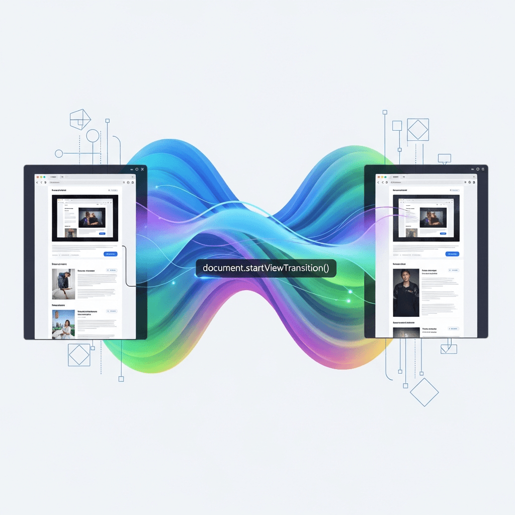
The core idea behind View Transitions is simple yet powerful: instead of directly manipulating the DOM, you tell the browser to take a snapshot of the current UI, then perform your DOM updates, and finally, the browser takes another snapshot of the new UI. It then seamlessly animates between these two snapshots, creating a fluid transition.
The document.startViewTransition() Method
This is the entry point for initiating a view transition. It takes a callback function where all your DOM updates should occur.
function updateTheDOM() {
  // All your DOM manipulation code goes here
  // e.g., changing content, adding/removing elements, changing classes
}

if (document.startViewTransition) {
  document.startViewTransition(() => updateTheDOM());
} else {
  updateTheDOM(); // Fallback for browsers not supporting View Transitions
}
When document.startViewTransition() is called:
- The browser captures the current state of the page (the "old" view).
- Your
updateTheDOM()callback function is executed, which updates the DOM to the new state. - The browser captures the new state of the page (the "new" view).
- The browser then orchestrates an animation between the old and new views using a set of pseudo-elements.
View Transition Pseudo-elements
During a view transition, the browser inserts a temporary pseudo-element tree into the DOM, which you can target with CSS to customize the animation:
::view-transition: The root pseudo-element, acting as a container for the entire transition.::view-transition-group(name): Represents a group of old/new snapshots for a specific element (named viaview-transition-name).::view-transition-image-pair(name): Contains the::view-transition-old(name)and::view-transition-new(name)pseudo-elements.::view-transition-old(name): A snapshot of the element before the DOM change.::view-transition-new(name): A snapshot of the element after the DOM change.
By default, the browser applies a cross-fade animation. You can override this using standard CSS animation properties on these pseudo-elements.
Setting Up Your First View Transition (In-Document)
Let's create a simple example where we toggle the content of a card and animate the change using View Transitions.
HTML Structure
<div class="card-container">
  <div id="myCard" class="card">
    <h2>Initial Content</h2>
    <p>Click the button to change this content.</p>
  </div>
  <button id="toggleContentBtn">Toggle Content</button>
</div>
CSS for Default Styling and View Transition Naming
.card {
  width: 300px;
  height: 200px;
  background-color: #e0f7fa;
  border: 1px solid #00bcd4;
  border-radius: 8px;
  padding: 20px;
  display: flex;
  flex-direction: column;
  justify-content: center;
  align-items: center;
  text-align: center;
  margin: 20px;
  box-shadow: 0 4px 8px rgba(0, 0, 0, 0.1);
  /* Crucial: Name this element for the view transition */
  view-transition-name: card-content;
}

button {
  padding: 10px 20px;
  background-color: #00bcd4;
  color: white;
  border: none;
  border-radius: 5px;
  cursor: pointer;
  font-size: 16px;
  margin-top: 10px;
}

/* Default View Transition animation (cross-fade) can be overridden */
::view-transition-old(card-content) {
  animation: fade-out 0.2s cubic-bezier(0.4, 0, 1, 1) forwards;
}

::view-transition-new(card-content) {
  animation: fade-in 0.2s cubic-bezier(0, 0, 0.2, 1) forwards;
}

@keyframes fade-out {
  from { opacity: 1; }
  to { opacity: 0; }
}

@keyframes fade-in {
  from { opacity: 0; }
  to { opacity: 1; }
}
JavaScript to Trigger Transition
const myCard = document.getElementById('myCard');
const toggleContentBtn = document.getElementById('toggleContentBtn');
let isContentA = true;

function updateCardContent() {
  if (isContentA) {
    myCard.innerHTML = `
      <h2>New Content!</h2>
      <p>This content has been dynamically updated.</p>
    `;
  } else {
    myCard.innerHTML = `
      <h2>Initial Content</h2>
      <p>Click the button to change this content.</p>
    `;
  }
  isContentA = !isContentA;
}

toggleContentBtn.addEventListener('click', () => {
  if (document.startViewTransition) {
    document.startViewTransition(() => updateCardContent());
  } else {
    updateCardContent(); // Fallback
  }
});
When you click the button, startViewTransition is called. It takes a snapshot of myCard. Then updateCardContent runs, changing myCard.innerHTML. Finally, startViewTransition takes another snapshot. Because myCard has view-transition-name: card-content;, the browser knows these are related and applies the default cross-fade between the ::view-transition-old(card-content) and ::view-transition-new(card-content) images.
Customizing View Transitions with CSS
The real power of View Transitions comes from customizing the animations. You can target specific pseudo-elements to create unique effects.
Let's enhance our card example to include a slide and scale effect instead of just a fade.
/* No change to .card styling or view-transition-name */

/* Custom animations for the card-content transition */
::view-transition-group(card-content) {
  animation-duration: 0.6s;
  animation-timing-function: cubic-bezier(0.25, 0.1, 0.25, 1);
  /* The group itself can animate, e.g., scaling */
  animation-name: slide-scale-group;
}

::view-transition-old(card-content) {
  animation: fade-out-slide 0.6s cubic-bezier(0.4, 0, 1, 1) forwards;
}

::view-transition-new(card-content) {
  animation: fade-in-slide 0.6s cubic-bezier(0, 0, 0.2, 1) forwards;
}

@keyframes slide-scale-group {
  from { transform: scale(0.9); opacity: 0.7; }
  to { transform: scale(1); opacity: 1; }
}

@keyframes fade-out-slide {
  from {
    opacity: 1;
    transform: translateY(0) scale(1);
  }
  to {
    opacity: 0;
    transform: translateY(-20px) scale(0.9);
  }
}

@keyframes fade-in-slide {
  from {
    opacity: 0;
    transform: translateY(20px) scale(0.9);
  }
  to {
    opacity: 1;
    transform: translateY(0) scale(1);
  }
}
Here, we've defined custom keyframe animations and applied them to ::view-transition-group, ::view-transition-old, and ::view-transition-new. The view-transition-group allows for animating the entire bounding box of the transition, while old and new animate their respective content snapshots.
Advanced View Transition Techniques: Shared Elements & Naming
The view-transition-name property is incredibly powerful for creating shared element transitions. When elements on the old and new views have the same view-transition-name, the browser recognizes them as the "same" element and smoothly animates their position, size, and other properties between the two states.
This is particularly useful for scenarios like:
- Thumbnail to Full-size Image: Clicking a thumbnail expands it to a full-size image, with the image appearing to grow from its original position.
- List Item to Detail View: Clicking an item in a list transitions to a detail page, with the selected item expanding into the main content area.
- Layout Changes: Animating elements that move from one container to another or resize significantly.
Example: Thumbnail to Full-size Image
Imagine a gallery where clicking a thumbnail opens a detailed view. We'll simulate this on a single page.
HTML
<div class="gallery">
  <img src="thumbnail1.jpg" alt="Thumbnail 1" class="thumbnail" data-id="1">
  <img src="thumbnail2.jpg" alt="Thumbnail 2" class="thumbnail" data-id="2">
</div>

<div id="detailView" class="detail-view hidden">
  <img id="detailImage" src="" alt="Detailed Image">
  <p id="detailCaption"></p>
  <button id="closeDetail">Close</button>
</div>
CSS
.gallery {
  display: flex;
  gap: 15px;
  margin: 20px;
}

.thumbnail {
  width: 100px;
  height: 100px;
  object-fit: cover;
  cursor: pointer;
  border-radius: 8px;
  transition: transform 0.2s ease;
}

.thumbnail:hover {
  transform: scale(1.05);
}

.detail-view {
  position: fixed;
  top: 0;
  left: 0;
  width: 100%;
  height: 100%;
  background-color: rgba(0, 0, 0, 0.8);
  display: flex;
  flex-direction: column;
  justify-content: center;
  align-items: center;
  z-index: 1000;
}

.detail-view.hidden {
  display: none;
}

.detail-view img {
  max-width: 90%;
  max-height: 80%;
  object-fit: contain;
  border-radius: 8px;
  box-shadow: 0 0 20px rgba(0, 0, 0, 0.5);
  /* Crucial: Give the detailed image a view-transition-name */
  view-transition-name: current-image;
}

.detail-view p {
  color: white;
  margin-top: 15px;
  font-size: 1.2em;
}

.detail-view button {
  margin-top: 20px;
  padding: 10px 20px;
  background-color: #f44336;
  color: white;
  border: none;
  border-radius: 5px;
  cursor: pointer;
}

/* Custom animations for the image transition */
::view-transition-group(current-image) {
  animation-duration: 0.5s;
  animation-timing-function: ease-in-out;
}

::view-transition-old(current-image),
::view-transition-new(current-image) {
  /* Prevent default image animation behavior */
  animation: none;
}

/* Other content (e.g., detail view background) can fade */
::view-transition-old(root) {
  animation: fade-out-bg 0.5s forwards;
}
::view-transition-new(root) {
  animation: fade-in-bg 0.5s forwards;
}

@keyframes fade-out-bg {
  from { opacity: 1; }
  to { opacity: 0; }
}
@keyframes fade-in-bg {
  from { opacity: 0; }
  to { opacity: 1; }
}
JavaScript
const gallery = document.querySelector('.gallery');
const detailView = document.getElementById('detailView');
const detailImage = document.getElementById('detailImage');
const detailCaption = document.getElementById('detailCaption');
const closeDetailBtn = document.getElementById('closeDetail');

gallery.addEventListener('click', (event) => {
  const thumbnail = event.target.closest('.thumbnail');
  if (!thumbnail) return;

  const imageUrl = thumbnail.src; // Assuming thumbnail.jpg and image.jpg are consistent
  const fullImageUrl = imageUrl.replace('thumbnail', 'image'); // e.g., thumbnail1.jpg -> image1.jpg
  const altText = thumbnail.alt;

  // Set the view-transition-name dynamically for the clicked thumbnail
  // This ensures only the *clicked* thumbnail is part of the shared transition
  thumbnail.style.viewTransitionName = 'current-image';

  if (document.startViewTransition) {
    document.startViewTransition(() => {
      detailImage.src = fullImageUrl;
      detailCaption.textContent = altText;
      detailView.classList.remove('hidden');
    }).finished.then(() => {
      // Clean up the dynamic view-transition-name after the transition finishes
      thumbnail.style.viewTransitionName = '';
    });
  } else {
    detailImage.src = fullImageUrl;
    detailCaption.textContent = altText;
    detailView.classList.remove('hidden');
  }
});

closeDetailBtn.addEventListener('click', () => {
  if (document.startViewTransition) {
    document.startViewTransition(() => {
      detailView.classList.add('hidden');
    });
  } else {
    detailView.classList.add('hidden');
  }
});
In this example:
- When a thumbnail is clicked, we dynamically assign
view-transition-name: current-image;to it. This tells the browser: "This is the element I want to track." - The
detailImagealready hasview-transition-name: current-image;in its CSS. - When
startViewTransitionis called, the browser sees the sameview-transition-nameon the clicked thumbnail (old state) and thedetailImage(new state). It then automatically animates the image's position and size between the two states. - The
::view-transition-old(root)and::view-transition-new(root)are used to fade the overall background/other content in/out. - Crucially, we remove the
view-transition-namefrom the thumbnail after the transition to avoid conflicts if another thumbnail is clicked.
Combining @starting-style and View Transitions
While both features address animation challenges, they excel in slightly different areas:
@starting-style: Ideal for animating the entry of individual elements into the DOM or when an element'sdisplayproperty changes fromnoneto visible. It's about animating an element from nothing to its final state.- View Transitions: Perfect for animating broader UI state changes or layout shifts where multiple elements might be affected, or when you want shared element transitions between different views. It's about animating between two existing states (snapshots).
Can they be combined? Absolutely! Imagine a scenario where a View Transition occurs, and within that new view, some elements are dynamically generated and need to fade in. @starting-style would handle the individual fade-in, while the View Transition would handle the overall page transition.
For instance, if your updateTheDOM() function inside startViewTransition adds new list items that have @starting-style defined, those list items will animate their entry within the context of the larger view transition.
Best Practices for Smooth Animations
- Prioritize Performance: Animations should be smooth (60fps). Stick to animating
opacityandtransformas they can be hardware-accelerated. Avoid animating properties likewidth,height,margin,paddingfrequently, as they cause layout recalculations. - Respect
prefers-reduced-motion: Users with vestibular disorders or those who simply dislike motion can set a preference to reduce animations. Always check forprefers-reduced-motion: reduceand provide a simpler, non-animated experience.css@media (prefers-reduced-motion: reduce) { ::view-transition-group(*), ::view-transition-old(*), ::view-transition-new(*) { animation: none !important; } @starting-style { /* Ensure elements appear instantly */ .my-element { transition: none !important; } } } - Semantic Transitions: Animations should serve a purpose, guiding the user's eye and providing context. Don't just animate for the sake of it. A subtle fade or slide is often more effective than a jarring, complex animation.
- Progressive Enhancement: Ensure your UI remains functional even if
@starting-styleor View Transitions are not supported (e.g., in older browsers). Theif (document.startViewTransition)check is crucial for this. - Test Across Devices: Animations can look different on various screen sizes and performance capabilities. Test thoroughly.
- Keep
view-transition-nameUnique and Simple: Whileview-transition-namecan be any string, keep it descriptive and ensure it's unique across the entire DOM for the duration of the transition.
Common Pitfalls and Troubleshooting
- Forgetting
view-transition-name: Withoutview-transition-name, View Transitions will treat elements as separate entities, leading to a default cross-fade for the entire document, not a shared element transition. view-transition-nameConflicts: If multiple elements have the sameview-transition-namein the same view (before or after DOM update), the transition might behave unexpectedly. Ensure uniqueness.- DOM Updates Outside
startViewTransitionCallback: Only DOM changes within thestartViewTransitioncallback are part of the animated transition. Changes outside will occur instantly. - Performance Issues: Overly complex animations or animating too many properties can lead to jank. Use browser DevTools (especially the Performance tab) to identify bottlenecks.
- Debugging View Transitions: Modern browser DevTools (e.g., Chrome DevTools) have a dedicated "Animations" panel and can show the pseudo-elements created during a view transition, allowing you to inspect and modify their styles in real-time.
- Browser Support: While support is growing rapidly, always check caniuse.com for the latest information and implement fallbacks.
@starting-styleScope: Remember that@starting-stylerules must be defined in a way that allows them to apply to the target elements. Often, placing them before or directly adjacent to the element's main style rule is sufficient.
Conclusion
CSS @starting-style and the View Transitions API are powerful additions to the web developer's toolkit, fundamentally changing how we approach UI animations. No longer do we need intricate JavaScript orchestrations or clever CSS hacks to achieve smooth entry/exit animations or sophisticated state changes.
@starting-style provides an elegant, CSS-native solution for animating elements into existence, making dynamic content feel more integrated and less jarring. The View Transitions API, on the other hand, empowers developers to craft rich, app-like experiences with seamless navigations and state changes, significantly enhancing user perception of speed and fluidity.
By mastering these features, you can elevate the user experience of your web applications, making them not just functional, but truly delightful to interact with. Embrace these modern CSS and JavaScript capabilities to build the next generation of intuitive and visually stunning web interfaces. Start experimenting today, and watch your UIs come to life!
Written by
CodewithYohaFull-Stack Software Engineer with 7+ years of experience in Java, Spring Boot, and cloud architecture across AWS, Azure, and GCP. Writing production-grade engineering patterns for developers who ship real software.