
Modern CSS Architecture: Styled Components, CSS Modules, & Utility-First Compared

Introduction
The landscape of front-end development has evolved dramatically, and with it, the way we write and manage CSS. Traditional CSS, while foundational, often struggles with scalability, maintainability, and avoiding naming collisions in large-scale applications. The global nature of CSS can lead to "specificity wars," dead code, and a general fear of making changes.
To combat these challenges, modern CSS architectures have emerged, offering structured, component-driven, and often encapsulated approaches to styling. This comprehensive guide will deep-dive into three prominent methodologies: CSS-in-JS (specifically Styled Components), CSS Modules, and Utility-First CSS (specifically Tailwind CSS). We'll compare their philosophies, examine their practical implementations, discuss their advantages and disadvantages, and help you determine which approach might be the best fit for your next project.
Prerequisites
To fully grasp the concepts discussed in this article, a basic understanding of the following is recommended:
- HTML and CSS fundamentals
- JavaScript (ES6+)
- Modern front-end frameworks/libraries (e.g., React, Vue)
- Familiarity with build tools like Webpack or Vite
The Challenge of Traditional CSS
Before diving into modern solutions, let's briefly revisit the pain points traditional CSS often presents:
- Global Scope: All styles by default exist in a global namespace, making it easy for styles defined in one part of your application to unintentionally affect another.
- Specificity Wars: Overriding styles often leads to increasingly complex selectors and
!importantdeclarations, creating a fragile and hard-to-debug codebase. - Dead Code: Identifying and removing unused CSS can be challenging, leading to bloated stylesheets and slower load times.
- Maintainability: As projects grow, managing a monolithic stylesheet or even a large number of loosely organized
.cssfiles becomes a significant burden. - Collaboration: Multiple developers working on the same CSS files can lead to conflicts and inconsistent styling.
Modern approaches aim to solve these problems by introducing concepts like encapsulation, colocation, and atomic styling.
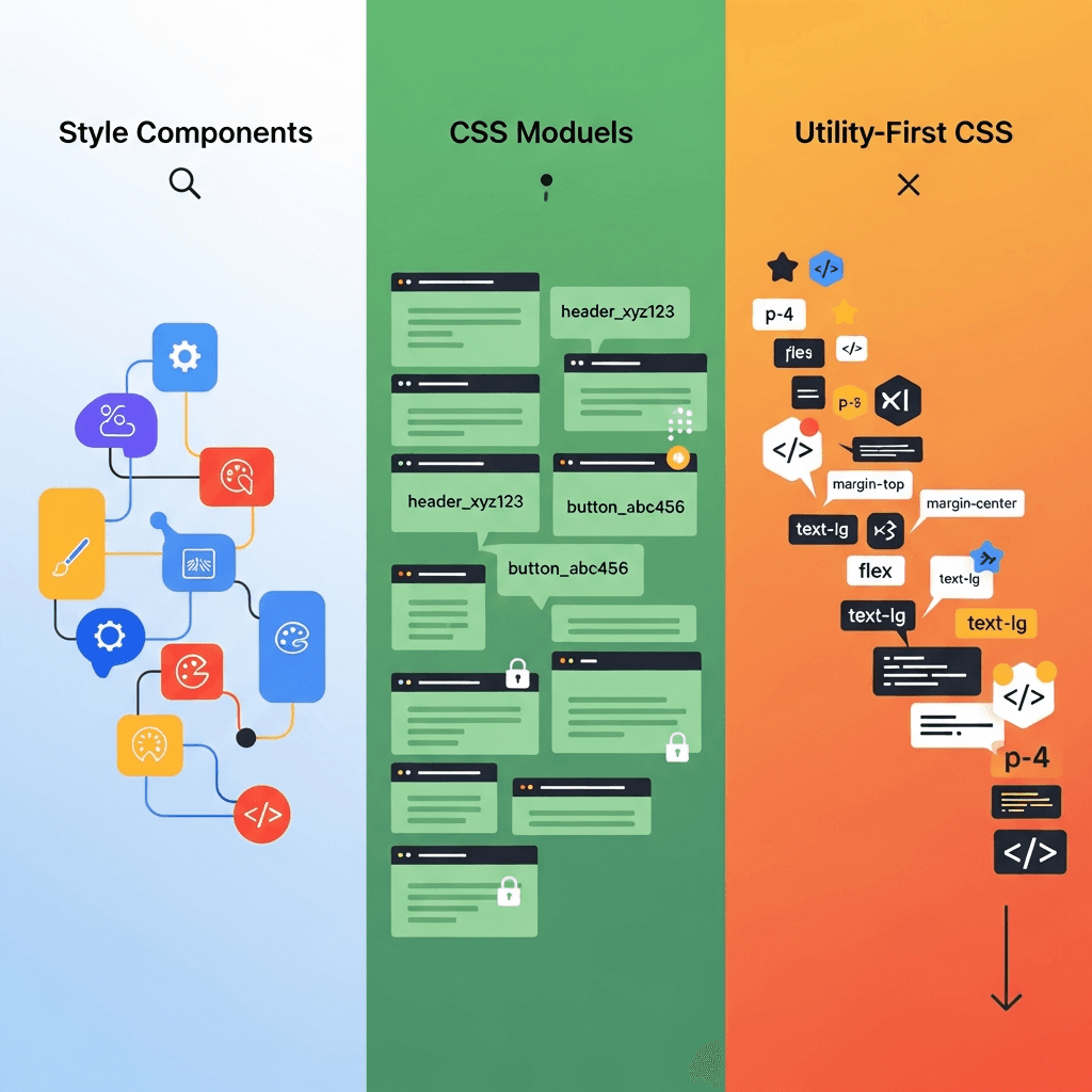
What is CSS-in-JS (Styled Components)?
CSS-in-JS is a paradigm where CSS is authored directly within JavaScript components. Styled Components is one of the most popular libraries in this category, leveraging tagged template literals to allow you to write actual CSS in your JavaScript files, directly scoped to your components.
How it Works
Styled Components allows you to create React components with styles attached to them. When these components are rendered, Styled Components injects the generated styles into the DOM. It automatically handles unique class names, ensuring that your styles are truly encapsulated and don't leak.
Pros
- Colocation: Styles are defined right alongside the component logic, making it easy to understand and maintain related code.
- True Encapsulation: Automatically generated unique class names prevent naming collisions and ensure styles are scoped to the component.
- Dynamic Styling: Easily integrate JavaScript props and state to create dynamic styles, making components highly adaptable.
- Theming: Robust support for theming, allowing you to define and apply global themes effortlessly.
- Dead Code Elimination: Since styles are tied to components, if a component is unused, its styles are also removed, leading to smaller bundles.
- No Class Name Conflicts: Eliminates the need for methodologies like BEM or SMACSS for class naming.
Cons
- Runtime Overhead: Styles are processed at runtime, which can introduce a slight performance overhead, though often negligible for most applications.
- Learning Curve: Developers new to CSS-in-JS might find the paradigm shift challenging.
- Bundle Size: The library itself adds to the overall JavaScript bundle size.
- Tooling: Debugging can sometimes be less straightforward than with traditional CSS due to generated class names, though browser extensions exist to help.
Code Example: Styled Components
Let's create a simple button component using Styled Components.
// components/Button.jsx
import styled from 'styled-components';

const StyledButton = styled.button`
  background-color: ${props => (props.primary ? '#007bff' : '#6c757d')};
  color: white;
  padding: 10px 20px;
  border: none;
  border-radius: 5px;
  cursor: pointer;
  font-size: 16px;
  transition: background-color 0.3s ease;

  &:hover {
    background-color: ${props => (props.primary ? '#0056b3' : '#5a6268')};
  }

  &:disabled {
    background-color: #cccccc;
    cursor: not-allowed;
  }
`;

function Button({ children, primary, ...props }) {
  return (
    <StyledButton primary={primary} {...props}>
      {children}
    </StyledButton>
  );
}

export default Button;

// App.jsx
import Button from './components/Button';

function App() {
  return (
    <div>
      <Button primary>Primary Button</Button>
      <Button>Secondary Button</Button>
      <Button disabled>Disabled Button</Button>
    </div>
  );
}

export default App;
What are CSS Modules?
CSS Modules are a specification for using CSS files where all class names and animation names are scoped locally by default. This solves the global scope problem of traditional CSS without completely abandoning .css files.
How it Works
When you use CSS Modules, your build tool (like Webpack or Vite) processes your .module.css files. It transforms class names into unique, hashed names (e.g., button_primary_abc123) and provides a JavaScript object mapping the original class names to their generated counterparts. You then import this object into your JavaScript component and apply the classes dynamically.
Pros
- True Encapsulation: Each CSS Module creates a unique namespace for its classes, preventing global conflicts.
- Familiar CSS Syntax: Developers can continue writing standard CSS, SCSS, Less, etc., without learning a new styling paradigm.
- No Runtime Overhead: Styles are processed at build time, resulting in static CSS files that are fast to load.
- Static Analysis: Tools can easily analyze your CSS Modules, making optimizations and linting straightforward.
- Composition: Supports CSS composition (
composes) for reusing styles across modules. - Separation of Concerns: Keeps CSS separate from JavaScript, which some developers prefer.
Cons
- No Dynamic Styling (out of the box): Directly integrating JavaScript props for dynamic styling is not as straightforward as with CSS-in-JS. You typically need to use conditional class names or CSS variables.
- Naming Conventions: Requires careful attention to class naming within the module to ensure clarity when importing into JS.
- Global Styles: Handling global styles (e.g.,
bodystyles, resets) requires explicit opt-out of local scoping using:global(). - Less Theming Support: Theming isn't as natively integrated as in CSS-in-JS, often requiring CSS variables or external libraries.
Code Example: CSS Modules
Let's refactor the button example using CSS Modules.
/* components/Button.module.css */
.button {
  padding: 10px 20px;
  border: none;
  border-radius: 5px;
  cursor: pointer;
  font-size: 16px;
  transition: background-color 0.3s ease;
}

.primary {
  background-color: #007bff;
  color: white;
}

.primary:hover {
  background-color: #0056b3;
}

.secondary {
  background-color: #6c757d;
  color: white;
}

.secondary:hover {
  background-color: #5a6268;
}

.disabled {
  background-color: #cccccc;
  cursor: not-allowed;
}
// components/Button.jsx
import styles from './Button.module.css';
function Button({ children, primary, disabled, ...props }) {
const buttonClass = `${styles.button} ${primary ? styles.primary : styles.secondary} ${disabled ? styles.disabled : ''}`;
// Or using a utility like 'clsx' or 'classnames'
// import clsx from 'clsx';
// const buttonClass = clsx(styles.button, {
// [styles.primary]: primary,
// [styles.secondary]: !primary,
// [styles.disabled]: disabled,
// });
return (
<button className={buttonClass} disabled={disabled} {...props}>
{children}
</button>
);
}
export default Button;
// App.jsx
import Button from './components/Button';
function App() {
return (
<div>
<Button primary>Primary Button</Button>
<Button>Secondary Button</Button>
<Button disabled>Disabled Button</Button>
</div>
);
}
export default App;What is Utility-First CSS (Tailwind CSS)?
Utility-First CSS is a paradigm where you build user interfaces by composing small, single-purpose utility classes directly in your HTML. Tailwind CSS is the most prominent and popular framework embodying this approach.
How it Works
Instead of writing custom CSS for each component, Tailwind provides a vast set of low-level utility classes (e.g., flex, pt-4, text-center, bg-blue-500). You apply these classes directly to your HTML elements. Tailwind then processes your code at build time, scanning for used utility classes and generating only the necessary CSS, purging any unused styles.
Pros
- Rapid Development: Speeds up development significantly as you rarely leave your HTML to write CSS.
- Consistency: Encourages a consistent design system by limiting choices to a predefined set of utilities, based on a configuration file.
- No Custom CSS (mostly): Reduces the need to write custom CSS, minimizing the risk of new, inconsistent styles.
- Small Production File Size: With PurgeCSS (integrated into Tailwind's JIT mode), only the CSS utilities actually used in your project are included in the final bundle.
- No Naming Concerns: Eliminates the need for naming classes altogether, avoiding BEM or similar methodologies.
- Responsive Design Made Easy: Built-in support for responsive prefixes (e.g.,
md:text-lg,lg:flex).
Cons
- HTML Bloat: Elements can accumulate many utility classes, making the HTML harder to read and potentially less semantic.
- Steep Learning Curve: Initially, memorizing or constantly looking up utility classes can be slow.
- Opinionated: While highly configurable, the utility-first approach fundamentally changes how you think about styling.
- Less Separation of Concerns: Some argue that mixing style classes directly in HTML violates the principle of separation of concerns.
- No true encapsulation: While classes are atomic, they are global. The mental model is that you're applying styles to an element, not defining a component's own styles.
Code Example: Utility-First CSS (Tailwind CSS)
Here's our button component styled with Tailwind CSS.
// components/Button.jsx
function Button({ children, primary, disabled, ...props }) {
  const baseClasses = "py-2 px-4 rounded text-white font-medium transition-colors duration-300";
  const primaryClasses = "bg-blue-500 hover:bg-blue-600";
  const secondaryClasses = "bg-gray-500 hover:bg-gray-600";
  const disabledClasses = "bg-gray-300 cursor-not-allowed";

  const buttonClasses = `${baseClasses} ` +
                        `${primary ? primaryClasses : secondaryClasses} ` +
                        `${disabled ? disabledClasses : ''}`;

  return (
    <button className={buttonClasses} disabled={disabled} {...props}>
      {children}
    </button>
  );
}

export default Button;

// App.jsx
import Button from './components/Button';

function App() {
  return (
    <div>
      <Button primary>Primary Button</Button>
      <Button>Secondary Button</Button>
      <Button disabled>Disabled Button</Button>
    </div>
  );
}

export default App;
Deep Dive: Encapsulation and Scoping
Understanding how each approach addresses encapsulation is key to choosing the right one.
- Styled Components: Achieves true encapsulation at runtime by generating unique class names for each styled component. This means the CSS for
MyButtoncannot accidentally affectMyOtherButton. - CSS Modules: Achieves encapsulation at build time by transforming local class names into globally unique hashes. When you import
styles.myClass, you're importing a unique string that won't conflict withmyClassin another module. - Utility-First CSS: Does not provide encapsulation in the traditional sense. All utility classes are global. The encapsulation comes from the composition of these utilities on specific elements, and the fact that you're less likely to write conflicting custom CSS because you're using a predefined system. The focus is on consistency across the entire UI rather than strict component-level style isolation.
Developer Experience and Workflow
Each approach offers a distinct developer experience:
- Styled Components: Feels very integrated with JavaScript component development. Developers enjoy the colocation and power of dynamic styles. Debugging involves inspecting generated class names, but browser extensions like the Styled Components Babel plugin can improve this. Refactoring components and their styles together is seamless.
- CSS Modules: Offers a familiar workflow for developers comfortable with traditional CSS. The explicit import of styles (
import styles from './MyComponent.module.css';) makes dependencies clear. The main difference is referencing classes via JavaScript objects (styles.myClass). Debugging is straightforward as you can see the original class names mapped in the browser's dev tools. - Utility-First CSS: Initially, there's a learning curve to memorize the utility classes. However, once familiar, development speed can be incredibly fast. The mental model shifts from "what CSS properties do I need?" to "what utilities can I compose?". IDE extensions (like Tailwind CSS IntelliSense) significantly improve DX by providing auto-completion and documentation on hover. Debugging involves inspecting the HTML directly to see applied classes.
Performance Considerations
Performance is a critical factor for any web application:
- Styled Components: Introduces a JavaScript runtime cost for style injection. While optimized, this can be a concern for highly performance-critical applications or devices with limited resources. The initial bundle size might be larger due to the library itself. However, it excels at dead code elimination.
- CSS Modules: Generates static CSS files at build time, incurring no runtime performance overhead. This often results in highly optimized, small CSS bundles, especially when combined with a CSS minifier. The build process handles unique naming, but there's no inherent mechanism for dead style removal beyond what your build tool provides (e.g., PostCSS).
- Utility-First CSS (Tailwind): With its JIT (Just-In-Time) compiler, Tailwind only generates the CSS that is actually used in your project, resulting in extremely small production CSS files. This is a significant performance advantage. The initial build time can be slightly longer due to the scanning and generation process, but subsequent builds are fast thanks to caching.
Theming and Dynamic Styling
How easily can you implement themes or change styles based on component props or state?
-
Styled Components: Excellent for theming and dynamic styling. It provides a
ThemeProvidercomponent and allows direct access to props within style definitions, making conditional styles and theme variables very natural.// theme.js export const lightTheme = { background: '#fff', text: '#333', primary: '#007bff', }; export const darkTheme = { background: '#333', text: '#fff', primary: '#6a0dad', }; // App.jsx import { ThemeProvider } from 'styled-components'; import { lightTheme, darkTheme } from './theme'; import Button from './components/Button'; // Our styled button function App() { const [theme, setTheme] = useState(lightTheme); return ( <ThemeProvider theme={theme}> <Button primary>Themed Button</Button> <button onClick={() => setTheme(theme === lightTheme ? darkTheme : lightTheme)}> Toggle Theme </button> </ThemeProvider> ); } -
CSS Modules: Less direct for dynamic styling. You typically rely on conditional class names in JavaScript or use CSS custom properties (variables) that can be manipulated via JavaScript. Theming usually involves changing CSS variables or swapping entire CSS Module imports.
// components/ThemedButton.module.css .button { background-color: var(--button-bg); color: var(--button-text); /* ... other styles */ } // components/ThemedButton.jsx function ThemedButton({ children, theme, ...props }) { const style = { '--button-bg': theme === 'dark' ? '#333' : '#eee', '--button-text': theme === 'dark' ? '#fff' : '#333', }; return <button className={styles.button} style={style} {...props}>{children}</button>; } -
Utility-First CSS (Tailwind): Dynamic styling is achieved by conditionally applying utility classes in your component's JavaScript, similar to how CSS Modules handle it. Theming is handled by customizing Tailwind's configuration file (e.g., defining
colors,spacing,fontFamily) or by using CSS variables in conjunction with Tailwind'sarbitrary valuesor[@apply]directive.// components/ThemedButton.jsx function ThemedButton({ children, theme, ...props }) { const bgColor = theme === 'dark' ? 'bg-gray-800' : 'bg-white'; const textColor = theme === 'dark' ? 'text-white' : 'text-gray-900'; return ( <button className={`py-2 px-4 rounded ${bgColor} ${textColor}`} {...props}> {children} </button> ); }
Best Practices for Each Approach
Styled Components
- Keep styles focused: Avoid overly complex or deeply nested styles within a single styled component. Break them down if necessary.
- Use props effectively: Leverage props for dynamic styling, but don't overdo it with too many conditional props. Consider CSS variables for simpler dynamic changes.
- Theming: Utilize the
ThemeProviderfor consistent design tokens across your application. shouldForwardProp: Use this utility to prevent unwanted props from being passed down to the underlying DOM element.attrs: Useattrsfor static attributes or props that should always be applied to the component.
CSS Modules
- Composition: Use
composesto share styles between modules, promoting reusability without duplication. - Global styles: Explicitly define global styles using
:globalin a dedicated global stylesheet or within a module for specific global overrides. - CSS Variables: Use CSS custom properties for theming or dynamic values that can be changed via JavaScript.
- Clear Naming: Maintain clear, descriptive class names within your
.module.cssfiles, even though they are locally scoped.
Utility-First CSS (Tailwind CSS)
- Configuration: Customize your
tailwind.config.jsto match your design system's colors, spacing, fonts, etc. This is crucial for consistency and maintainability. - Component Extraction (
@applysparingly): For truly complex or frequently repeated components, consider extracting them into a React/Vue component. Use@applywithin a dedicated CSS file for component-specific styles only when the utility classes become excessively verbose and repetitive in your HTML, and only for creating new utility components, not for general styling. Overuse of@applycan negate the benefits of utility-first. - Plugins: Leverage Tailwind plugins for common patterns not covered by core utilities (e.g., custom forms).
- IDE Integration: Use the Tailwind CSS IntelliSense extension for VS Code or similar for your IDE to boost productivity.
Common Pitfalls and Anti-Patterns
Styled Components
- Over-nesting: Deeply nesting selectors (more than 2-3 levels) can make styles hard to read and debug, similar to traditional CSS preprocessors.
- Complex logic in templates: Avoid putting too much complex JavaScript logic directly into your styled template literals. Extract it into helper functions or component props.
- Global styles via
createGlobalStyle: UsecreateGlobalStylesparingly for true global resets or base styles. Don't use it for component-specific styles.
CSS Modules
- Forgetting
:global: Accidentally using local classes for elements that should have global styles (e.g.,html,body). - Too many tiny modules: While granularity is good, having a module for every single element can lead to excessive imports and fragmented code. Group related styles logically.
- Mixing local and global styles inconsistently: Decide on a clear strategy for global vs. local styles and stick to it.
Utility-First CSS (Tailwind CSS)
- Avoiding custom CSS entirely: While Tailwind aims to minimize custom CSS, it's not a silver bullet. Sometimes, a complex design might genuinely require a small amount of custom CSS, which you can integrate using
@layeror arbitrary values. - Over-reliance on
@apply: As mentioned, using@applytoo much can lead to a custom CSS layer that needs maintenance and can reintroduce some of the problems Tailwind aims to solve. - Not configuring Tailwind: Using Tailwind out-of-the-box without customizing it to your design system can lead to generic-looking UIs and missed opportunities for consistency.
- Ignoring semantic HTML: While Tailwind encourages utility classes, it's still important to use semantic HTML elements (
<button>,<a>,<nav>, etc.) for accessibility and SEO.
Choosing the Right Tool for Your Project
There's no single "best" solution; the ideal choice depends on your project's specific needs, your team's expertise, and your design philosophy.
-
Choose Styled Components if:
- You are primarily working with a component-driven framework like React.
- You value colocation of styles and logic.
- Your application requires highly dynamic, prop-driven styling and robust theming.
- Your team is comfortable with JavaScript and the idea of writing CSS within JS.
- You want strict encapsulation and automatic dead code elimination.
-
Choose CSS Modules if:
- You prefer to keep your CSS separate from your JavaScript, maintaining a clear separation of concerns.
- Your team is more comfortable with traditional CSS syntax and tooling.
- You need strong encapsulation but want the performance benefits of static CSS.
- You're working on a project that might involve multiple frameworks or a more traditional front-end setup alongside modern components.
- You want to leverage existing CSS preprocessors (Sass, Less).
-
Choose Utility-First CSS (Tailwind CSS) if:
- You prioritize rapid development and consistent design across your application.
- You prefer composing UI from atomic classes over writing custom CSS.
- Your project has a well-defined design system that can be mapped to Tailwind's configuration.
- You are building a new project from scratch where you can embrace the utility-first philosophy fully.
- You value the smallest possible CSS bundle size.
Hybrid Approaches
It's also common to see hybrid approaches. For instance, you might use CSS Modules for component-level encapsulation and a utility framework like Tailwind for rapid prototyping or specific layout challenges. Or, you could use Styled Components for complex, dynamic components and global CSS variables for a simpler theming mechanism.
Conclusion
Modern CSS architecture offers powerful solutions to the long-standing challenges of styling large-scale web applications. Styled Components provides unparalleled dynamic styling capabilities and colocation, CSS Modules offers true encapsulation with familiar CSS syntax, and Utility-First CSS (Tailwind) enables incredibly rapid, consistent development with minimal CSS footprint.
Each approach has its unique strengths and trade-offs. The key is to understand these differences and select the methodology that best aligns with your project's requirements, your team's preferences, and the overall goals of your application. By making an informed decision, you can build more maintainable, scalable, and delightful user interfaces for years to come. The future of CSS is flexible, powerful, and component-centric, empowering developers to craft beautiful web experiences with confidence.
Written by
CodewithYohaFull-Stack Software Engineer with 5+ years of experience in Java, Spring Boot, and cloud architecture across AWS, Azure, and GCP. Writing production-grade engineering patterns for developers who ship real software.